
The design of both the iOS and watchOS apps was centered around making search requests as efficient as possible. Visually, I wanted to embrace the text-heavy content of Wordini, but wanted to avoid it feeling cold and clinical. Putting the search interface front-and-center on the iOS app and eschewing a standard tab bar interface for a custom one helped to maximize vertical real estate for search results, while also providing more minimal UI elements that put the focus on letters and words.
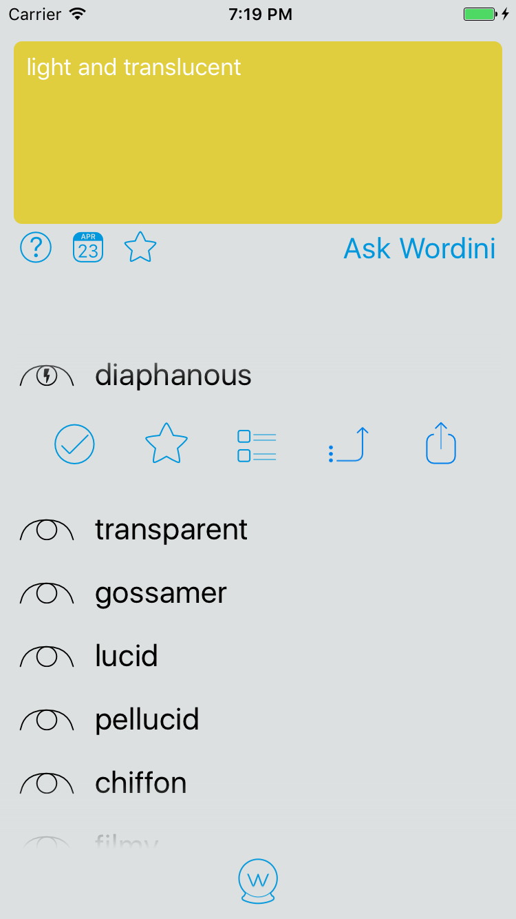
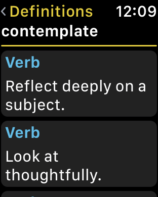
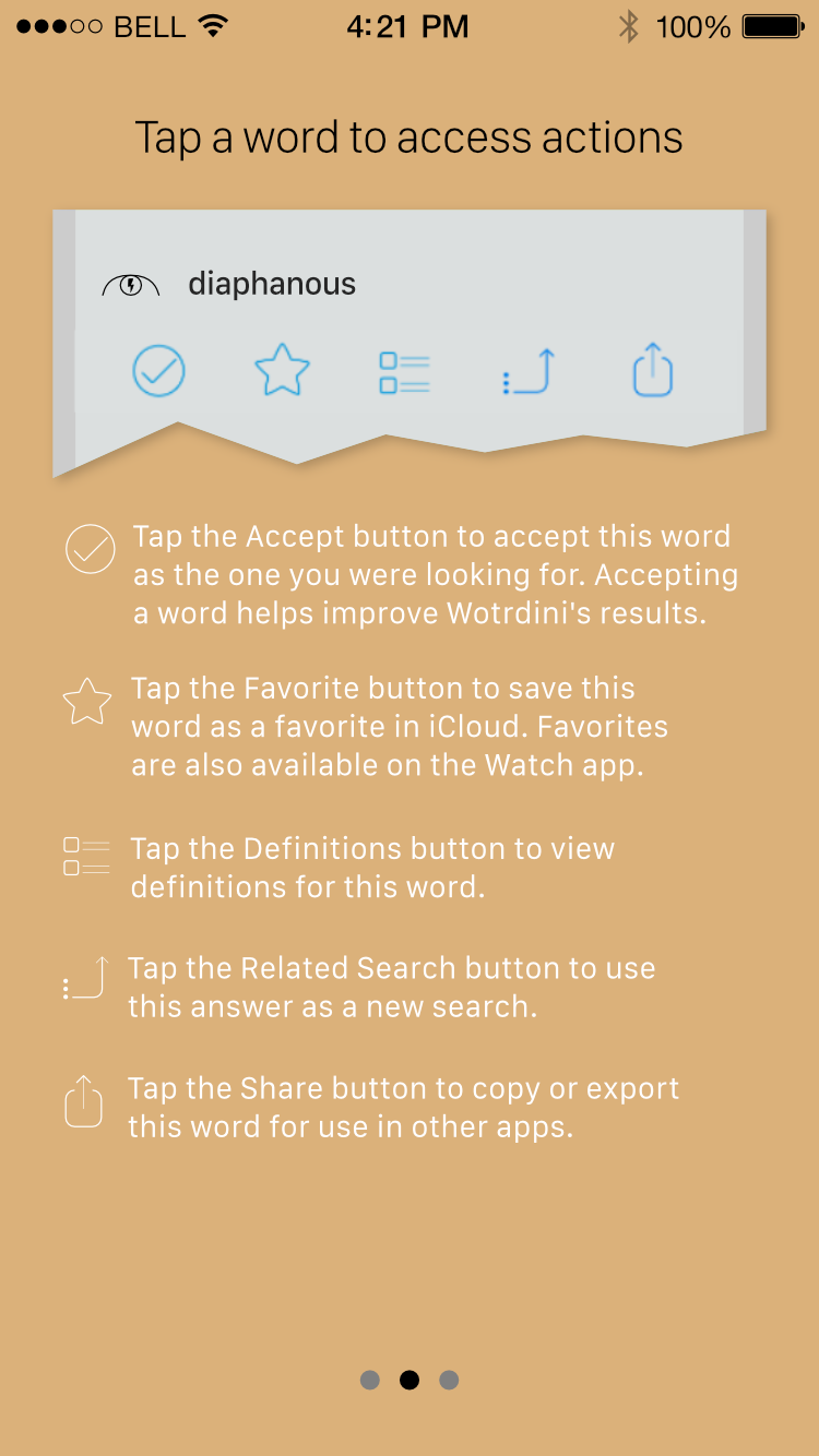
Originally Wordini had a Tinder-esque swipe interface for choosing which word was the right answer, but was changed in version 2.0 to a list. This also provided an opportunity to add a toolbar of actions that is accessible through a tap on the word, providing features such as adding the word to a new Favorites list (synced via iCloud to the Watch app). A "search on word" action was added after seeing that people often used an answer word to look for synonyms. 3D Touch was also added to answer words to allow quick views of their definitions and access to actions. Wordini 2.0 is thus both more efficient in its core purpose of providing the right word quickly, and also more powerful in ways that matters to users.
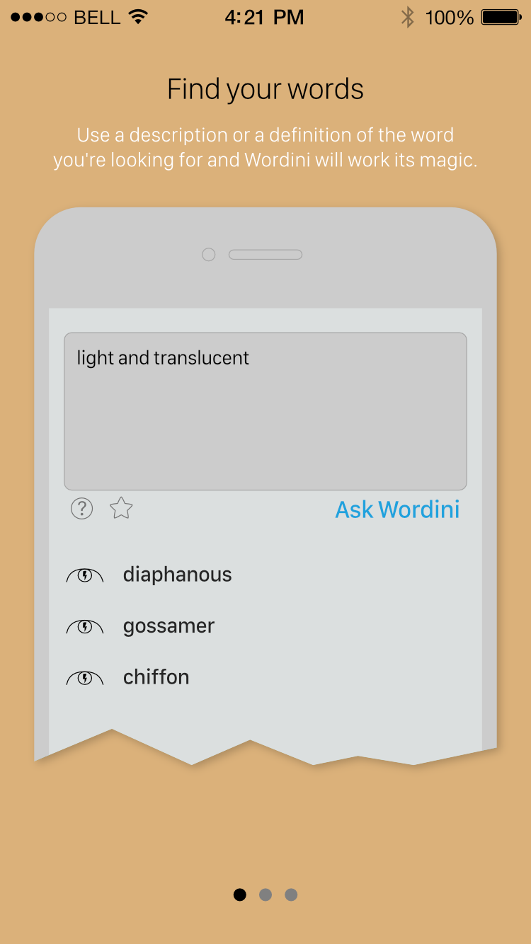
Originally Wordini had an onboarding process with intricate animations that demonstrated the search process. Revisiting this flow, I realized that while the animations certainly got the point across in a nice way, this extensive handholding was a sign that the UX might not be as intuitive as it should be, and this was a significant reason for redesigning the interface in version 2.0.
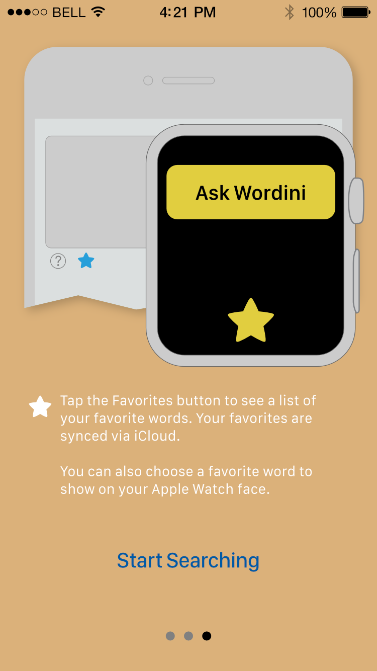
With the redesign in 2.0 creating a more straightforward interface and with its additional actions available to users, I focused on showcasing these actions and their associated icons. I used an abstracted, desaturated representation of the interface with blue highlights to focus on interaction points. I reserved the flow exit button for the final screen, as I wanted users to at least glance at what's available, and felt that three screens was not too onerous to swipe through.